Linear Regression notes
Where the value of one property changes directly (or roughly in proportion) to another (e.g. the greater the distance walked the more energy expended) there is said to be a linear or straight line relationship.
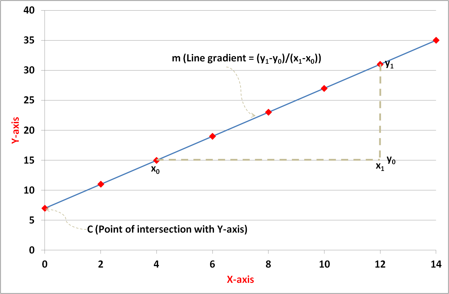
The equation of a straight line is given by y = mx + c where:
In Figure 1 the line intersects the 'y' axis at 7 (= c). The gradient is calculated by 'change in y' divided by 'change in x' i.e. (31 - 15) / (12 - 4) = 2 (= m). Therefore, the equation of the straight line graph on the left is y = 2x + 7.
However, where properties have a linear relationship, data collected and plotted from real-life scenarios rarely lie exactly on a straight line. Measurement errors, environmental factors and weak or complex relationships between properties can produce data variability and deviation from the expected straight line.
This investigation aims to explore the statistical principle of Linear Regression (relationship between variables) and show the application of different analytical tools to this subject.
Figure 1: Straight line graph illustration
Data source
There are plenty of publicly available datasets that are commonly used to demonstrate aspects of Data Science but I’m keen to seek out new sources to analyse. I set myself the challenge of exploring the relationship between price and mileage of cars in the second hand (UK) market. For the purposes of this task I wrote a Python web scraping programme to extract data from a reputable car selling website.
Commercial web sites rarely provide data in a compact and readily downloadable form – the data being spread over multiple web pages. In collecting large volumes of data this can require significant numbers of page requests that can place a processing burden on the servers of the hosting company and impact their normal business operations. It is therefore good etiquette to include a time delay of a few seconds between page requests.
The dataset obtained was extracted in November 2017 and contained the following vehicle characteristics for Vauxhall cars:
For the following analysis I’ve used a subset of the data (specifically ‘Vauxhall Agila’ model/make which comprises 399 data records) in order to make the demonstration of some features simpler.
Tool: Excel
One of the beauties of Excel, and the reason I am such an advocate of this tool, is the ability to easily scroll through, filter, manipulate and graph the data. In Office 365, Excel can accommodate over one million rows of data but this would still not be practical for handling the scale of today’s Big Data.
Data manipulation
The fields in the raw data relevant to this study are ‘mileage’ and ‘price’. A quick scan of the data shows that the contents are numeric values with their respective units (e.g. “1,059 miles”, “£8,000”). Consequently, Excel treats these as text strings and before any analysis can be performed on the data or graphs generated they need to be converted to numbers. This Data Cleaning step is commonly required in order to prepare data for analysis. Fortunately, Excel has a range of inbuilt spreadsheet functions that help with data manipulation.
For example, the SUBSTITUTE command which replaces one text string with another has the following format:
If cell “A1” contains the value “1,059 miles” the command in a new cell “=substitute(A1,"miles","")” yields the numeric result “1059”.
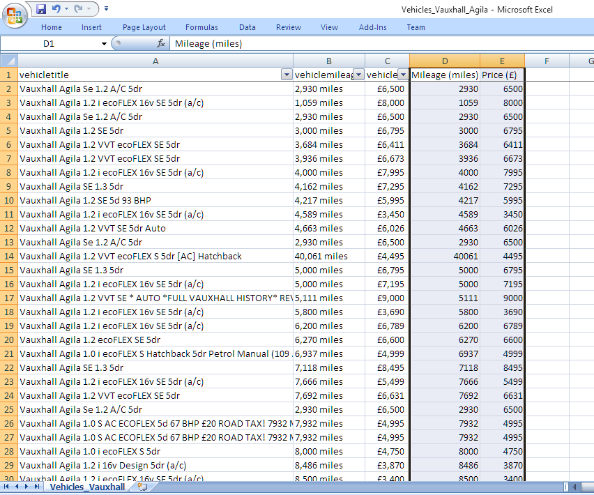
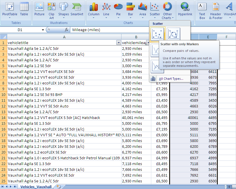
Figure 2 shows the key fields (i.e. vehicle make/model, mileage, price) for a sample of the records and the converted dimensionless fields (i.e. mileage and price without units). Excel offers a choice of multiple graphing tools which can be selected from the 'Insert' menu. A Scatter-Plot allows bivariate data (in this case price v mileage) to be graphed. Figure 3 illustrates how the data range is selected and the graph choice applied.
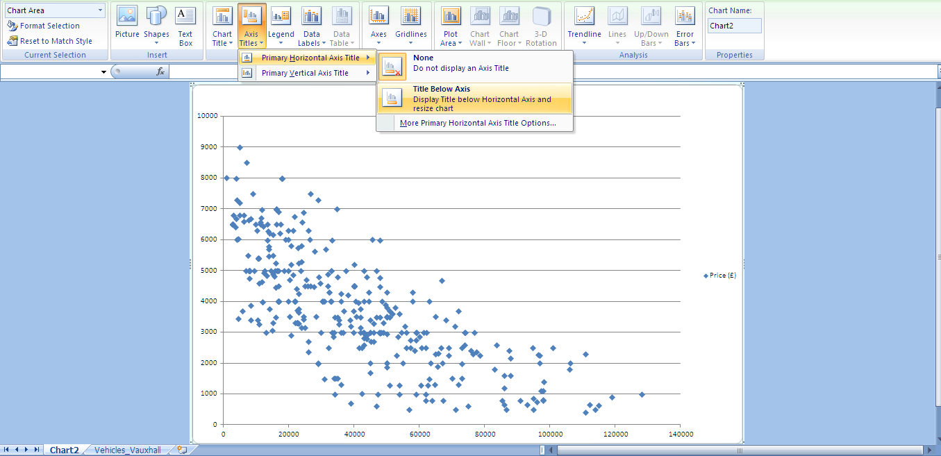
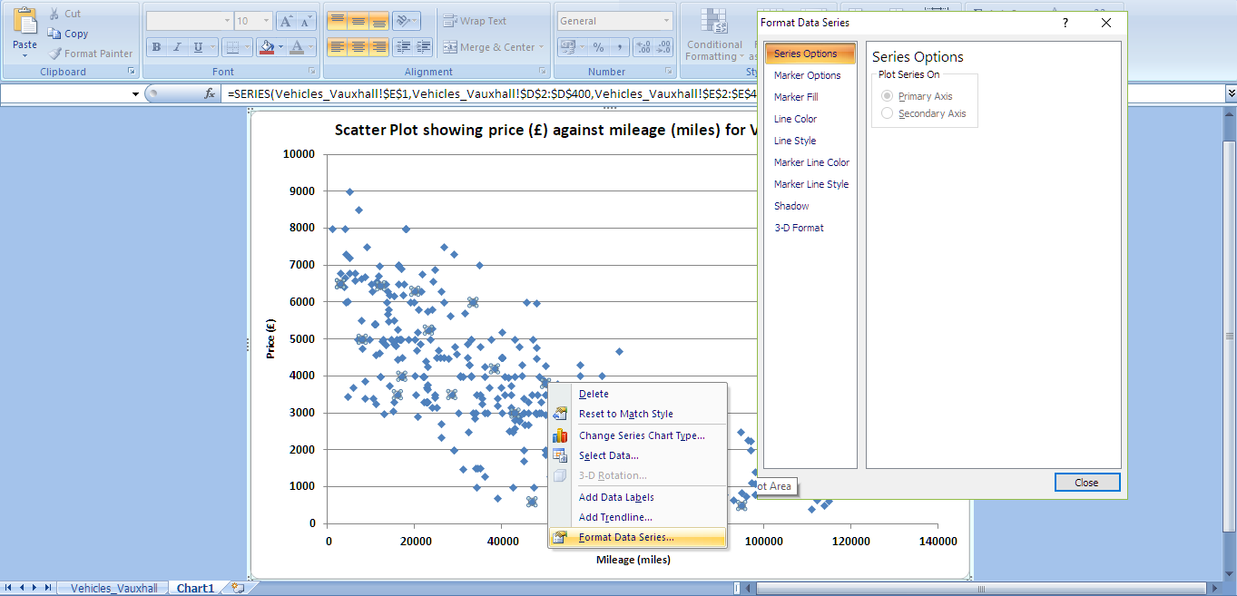
The labelling of graph with titles and axes, and the (colour and style) formatting of lines and data points can be tailored quickly and easily through Excel's 'Design' and 'Layout' menu options as demonstrated in Figures 4 and 5.
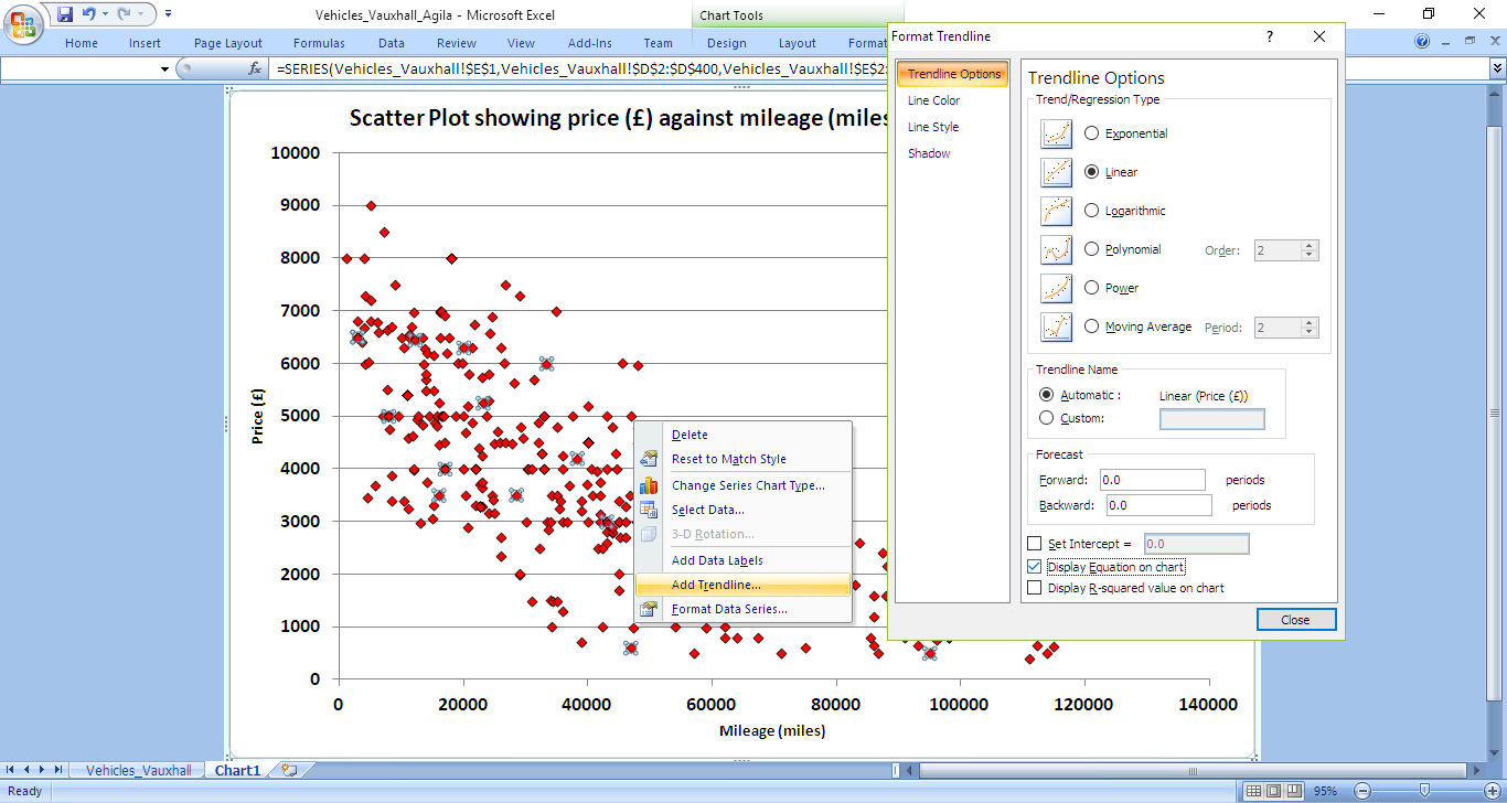
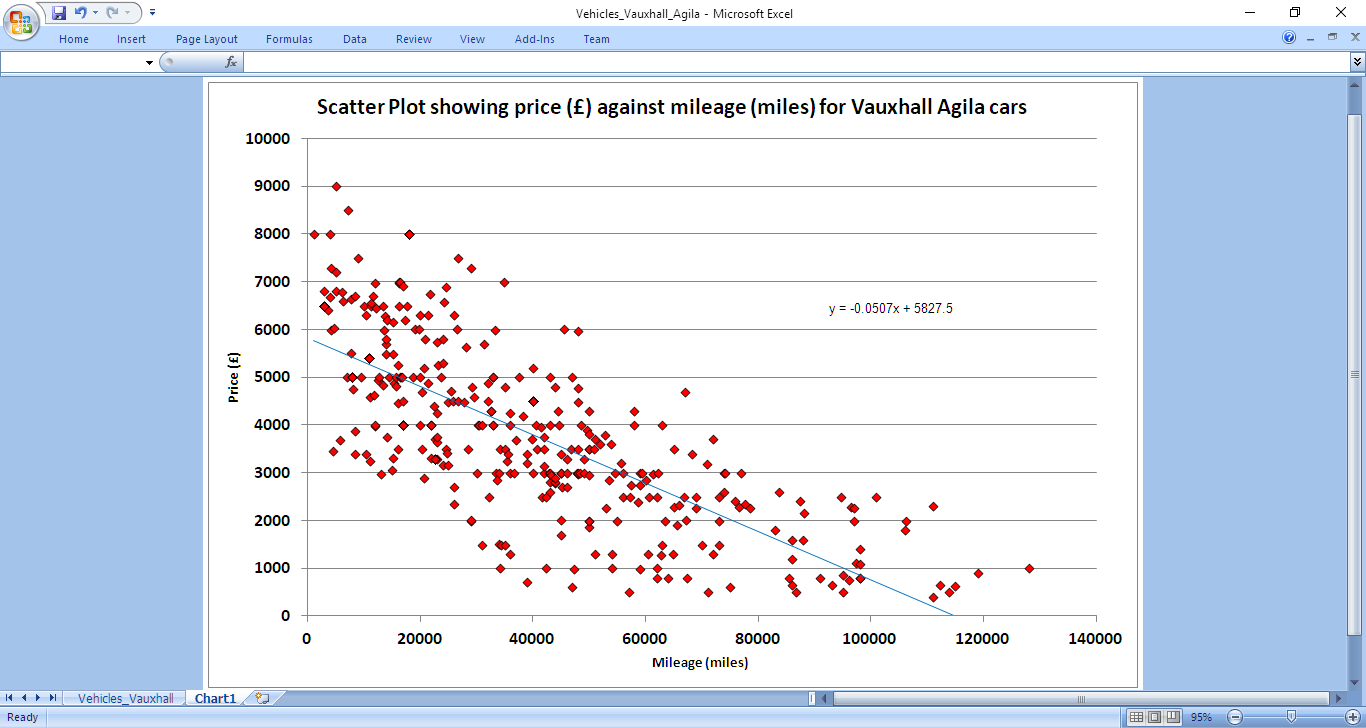
The 'Layout' menu option also provides a 'Trendline' facility. Figures 6 and 7 show the results of selecting the 'Linear' regression type and the 'Display Equation on chart' options. For this dataset Excel calculates the equation of best-line fit to be y = 5827.5 - 0.0507x. In the context of the car dataset, this can be interpreted as:
car price = £5,827.50 - £0.05 * car mileage
While the line appears to follow the trend of data values and indicate a correlation between mileage and price, the most notable feature is the wide distribution of points either side of the line. This data shows second hand cars with similar mileage have very different prices. Other factors such as car age / registration date, condition, engine size, break-horsepower, fuel type, (manual / automatic) drive, features, sellers' location, oustanding warranty, service history, number of previous owners and features (such as alarm / air conditioning) amongst others may influence the price. This would seem like a good candidate for multi-variate regression investigation.
Although a subjective assessment concluded the variables were correlated there are ways of placing a measure on the degree (or strength) of any correlation. One common mathematical formula is Pearson's Correlation Coefficient (ρ) given by:
where represents each of the 'x' values, represents each of the 'y' values, is the MEAN of all the 'x' values, is the MEAN of all the 'y' values and is the number of data items. The formula can take values in the range from '+1' (perfect positive correlation) to '-1' (perfect negative correlation). Applying this formula to the dataset generates a Pearson Coefficient Correlation value of -0.75 (to 2 decimal places) which can be interpreted as fairly strong negative correlation.
Manual Calculation
Where practical, it can be helpful to analyse the data manually to appreciate the statistical equations and have an expectation of the results to anticipate from using the Data Science tools. For bivariate (i.e. x-y) datasets the equation (y = mx + c) which produces a line of best fit can be determined using Simple Linear Regression which minimises the total variance (or distance of data points from the straight line). The formulae for calculating the ‘gradient’ (m) and ‘intercept’ (c) are given by:
For the 399 Vauxhall Agila records the mean mileage () was calculated to be 37,615 miles and the mean price () £3,919. Using the formulae above the gradient (m) was manually calculated to be -0.05 (to 2 decimal places) and (c) to be 5827.52, values which are consistent with those generated by Excel's linear regression evaluation shown in Figure 7.
Tool: Octave
Octave is a programming tool that can perform linear algebra calculations and matrix manipulations efficiently. We can use Octave to determine a straight line equation (e.g. for some specific values of 'a' and 'b') that minimises the total difference between the individual 'y' values of the dataset and the corresponding 'y' value predicted by the equation. As the difference is dependent on the choice of 'a' and 'b' it is commonly referred to as the 'cost function' (or the 'cost penalty') - the lower the difference or cost, the better the fit of the straight line equation to the dataset. The standard cost function (J) is given by:
where are the 'y' values of the dataset and is the number of data points.
The objective is to find values of 'a' and 'b' that minimise this function. One approach to find a suitable solution might be to try values exhaustively over a specified range but this can be time consuming and processor intensive. The solution is to use a technique called Gradient Descent which requires the user to specify initial values for 'a' and 'b' and to repeatedly adjust them (based on an estimation of the cost function gradient) until the values converge. The required iterative equations are:
where is termed the Learning Rate (and lies in the range 0 < < 1). This is a device used in numerical computations to reduce the change in 'a' and 'b' at each iteration. The gradient derivatives can be determined from differentiating the J(a,b) function above giving:
Substituting the partial derivative terms into the earlier equations gives:
Following standard coding practice the programme has been implemented in modules - the main procedure imports the dataset from a Comma Separated Variable (CSV) file, initialises parameters (i.e. the learning rate and the number of iterations) and makes calls to sub-procedures that perform specific tasks: plotVehicleData to generate a scatter plot of the data, gradientDescent to execute the algorithm which seeks a convergent solution and computeCost to calculate the cost on each iteration.
In the code the values of 'a' and 'b' are represented by the 2D matrix array 'theta' (b = theta(1,1) and a = theta(2,1)).

Figure 8: Linear Regression main procedure (Octave code)
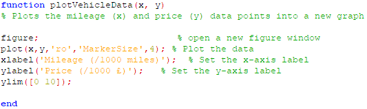
Figure 9: Data plotting module (Octave code)
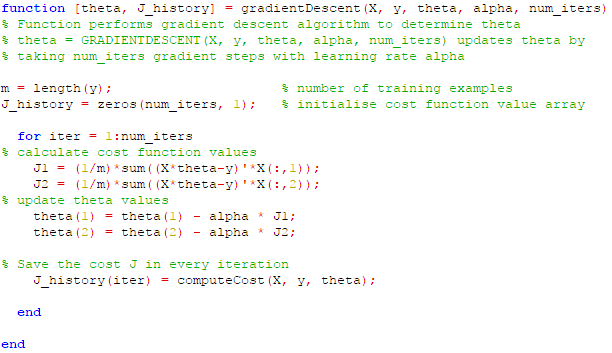
Figure 10: Gradient Descent module (Octave code)
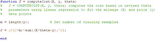
Figure 11: Compute Cost module (Octave code)
The following graph (Figure 12) displays the data points and overlays the straight line given by the values calculated for 'a' (theta(2,1)) and 'b' (theta(1,1)) after 0.5 million iterations. At this point the line equation is y = 5826.15 - 0.05x which is within 0.02% of the formulae calculated manually above.
However, the values for 'a' and 'b' are highly sensitive to the number of iterations. Figure 13 shows how the cost profile changes with the number of iterations performed. With fewer than 0.1 million iterations (and ), the higher cost indicates the values are not optimised and further calculations are required. Even though the cost appears to stabilise after 0.1 million iterations suggesting convergence, the values of 'a' and 'b' at this point differ by 3.5% from the manually derived line equation. Clearly, in this investigation an accurate solution has only been obtained after a significant number of iterations. The number of calculations (and processing effort) can be reduced by increasing the Learning Rate. For example, setting an value of 0.0005 can achieve convergence and yield a similar line equation formula in just 50 thousand iterations. However, when the Learning Rate increases further to 0.001 the algorithm diverges and no solution is possible. In each application of the algorithm for different datasets there is trade-off to be gained between the size of the Learning Rate and the number of iterations which impacts performance and solution accuracy.
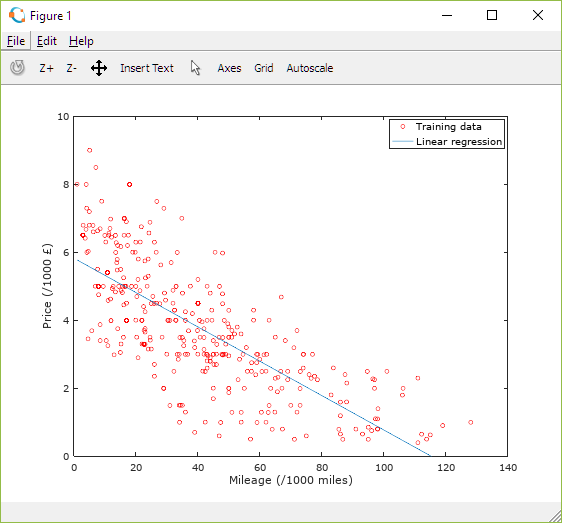
Figure 12: Plot of Vauxhall Agila vehicle dataset and regression line derived using Gradient Descent algorithm
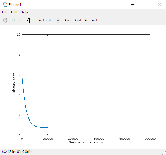
Figure 13: Plot of Cost as a function of number of Gradient Descent iterations performed
The principles followed above were inspired by Andrew Ng's Machine Learning course. For more details on the mathematical principles of Linear Regression I would thoroughly recommend attending his course.